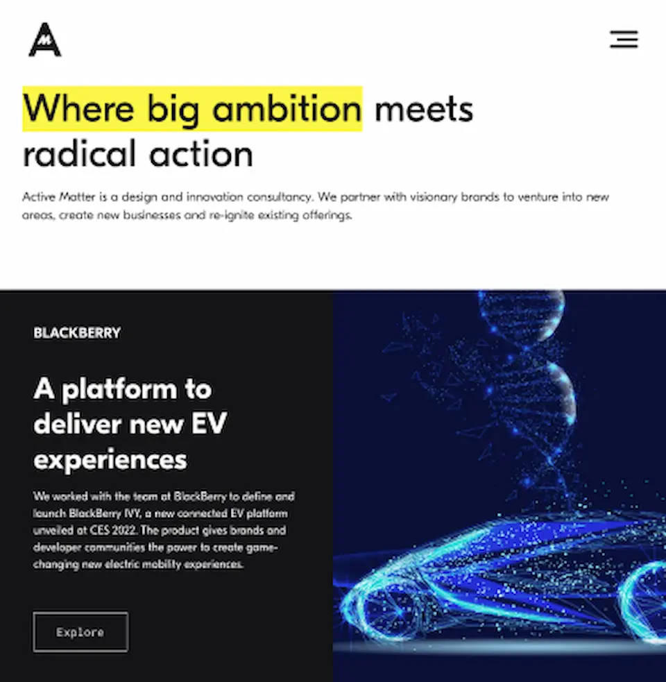
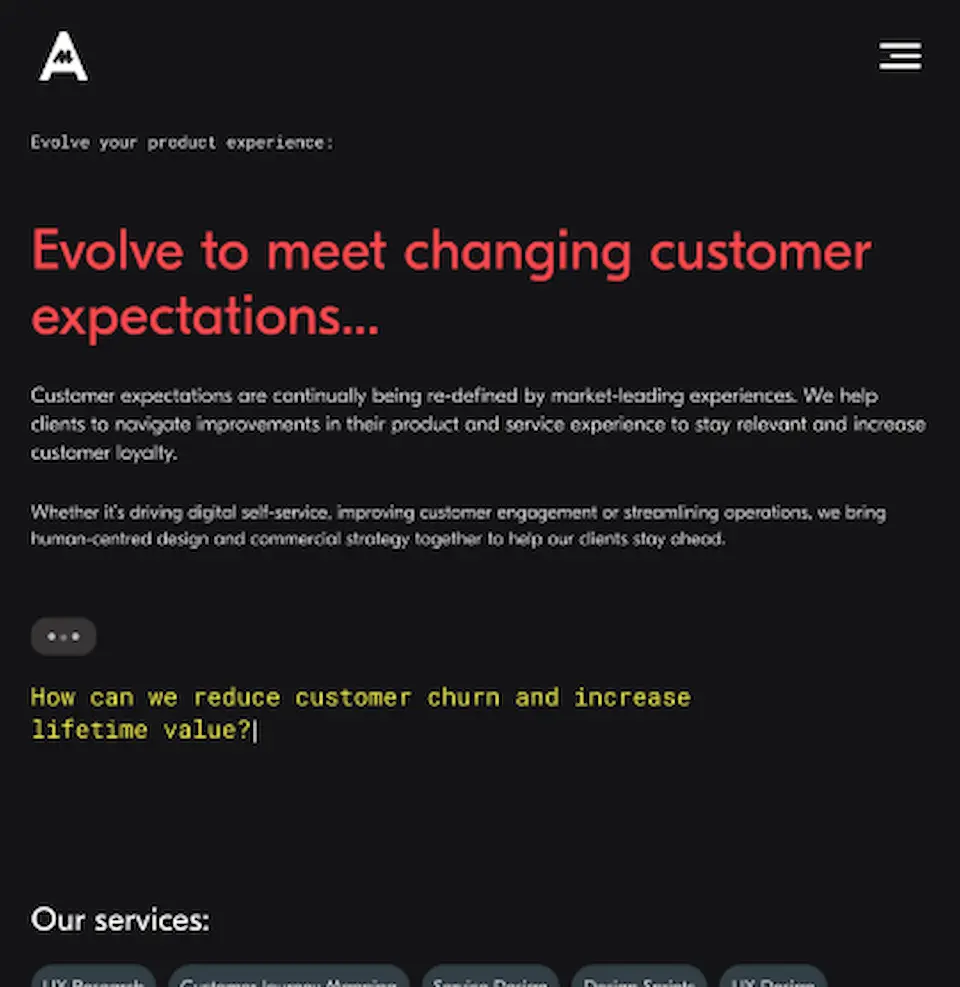
My final piece of work before leaving my friends at Active Matter for pastures new was the second major update to their website that I had made. This time the goal was to have a more striking look, and more purposeful messaging.
It's the little touches
As with so much in the design world, its the last 5% that makes for the most significant change in the “feel” of a project. The attention to detail; the craft. We wanted to make sure that this project really felt like there was a real attention to detail given to it.
In this case, that meant interpreting the designs being worked on creatively – turning a flat illustration into an animated mural, turning a highlighted bit of text in the header into an animation which we used in a great many other places. Making sure that all these small interactions felt like they had been crafted, rather than just put together, was really important here – the website might not be the first point of contact for prospective customers, but it is an important reference point and a user’s first impression of what they see here will inform their opinion of the care that the Active Matter team will take of thier brand and product.
The tech
Front-end: Gatsby, React, PostCSS
Back-end: Sanity
Hosting & Continuous deployment: Netlify
My Responsibilities
Solution architecture, Content modelling, CMS configuration, Front-end development, Infrastructure configuration